


Your blog is the face of your brand. It’s like a living, breathing. advertisement of who you are, what you represent, and why people should like and listen to you. For this reason, your blog design is crucial to the success of the blog.
I didn’t study design in college, but post collegiate experience led me to pursue photography, where in the editing software, I discovered a graphic design component which I came to love. Most of my graphic design skills are self taught and I am far from an expert. But I have picked up some tips through the years. These were some of the tips I based the foundation of my blog design on.

In researching this post, I visited tons of top bloggers and looked at their designs, comparing them to my own and seeing what similarities they contained. I found a re-occuring theme of 5 key elements every design had in common and from this developed these tips.
So today, I’d like to share with you these 5 fundamental blog tips, in hopes that you are able to apply them in your own blog design.

1.Develop a clear vision
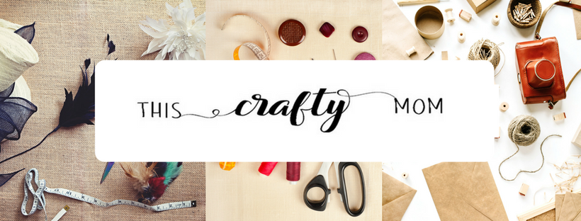
It starts with the name. You want to pick a name that embodies your blog. Mine, This Crafty Mom represents the things that represent me. I’m an arts and crafts kind of girl. I love to create: crafts, photography, writing all make up most of who I am. Except for the biggest part of me, being a mom.
Your blog name will drive your vision. As soon I knew my name, I had a simple, and clear idea of what I wanted my logo to look like. I played around with the design for a few minutes and loved the result. To me, my logo is the biggest part of my brand. But I also knew like my logo, I wanted my blog to have a clean, crisp appearance with a slightly craftsy vibe. If you have some graphic design basics and the correct software, you can easily design your own logo. If not, the job is easily outsourced. I personally offer logo design as one of my services. You can get details about that here.
As I mentioned in my post on starting a blog, I actually found my theme on Etsy. I did look through the WordPress and Bluehost options but didn’t find exactly what I had envisioned. Going with an Etsy seller presents a few unique problems so be sure to do your research before buying one. For me the benefits outweighed the costs.
2. Keep it clean.
A simple and easy design technique found in almost any medium is white space. White space is strategically leaving parts of a design completely blank. This is not only a technique found in graphic design, but also in photography and many other arts. The idea behind it is that it enhances the beauty of the subject without complicating the overall picture with meaning or context.
This concept works espcially well with blog design. Spend a few minutes parusing the sites of well known blogs. Looking at their blogs you are sure to find a common theme. White space. They don’t clutter the sidebars, headers or footers. The likely leave a lot of white space. This leaves you to focus on their words, which are in fact, the most important element on the page.

3. Keep it minimal
Fancy fonts are…well just that, fancy. And they are often hard to read. I love a cute font as much as anybody but if I’m having to read more than a few words, it complicates things. And you don’t want to make things complicated for your reader. Choose a clean, simple font and skip the bells and whistles.
Be sure to keep your site navigation simple as well. You want your reader to be able to easily find what they are looking for. Be sure to create pages where you can link similar content in categories beneath. Keep clear and concise. Again, simple = easy. Your busy readers want easy.
Don’t clutter your site with ads. I get it, ads are a necessary evil. I use them myself, but I try to keep them to a minimum and place them where they flow somewhat naturally with my content. I have seen some blogs that just slap them on like bumper stickers. It’s not a good look and can turn off your reader. Be very strategic about where you place ads, and maintain as much control of this as possible with any ad agency you decide to use.
4. Make sure it’s compatible & quick to load
Today’s world moves fast and everyone struggles to keep up. No one has time for slow-loading blogs so going with a reliabile host, who will keep your site streaming at an optimal speed is crucial.
However, you also have to keep the mobile user in mind. The majority of your audience isn’t coming to you from being a computer screen anymore. Most of your readers are looking at a phone or tablet. They are on mobile devices and it is imperative that your site be compatible with these. Do not be suckered into a theme that is not mobile combatibile. It may drive away your readers before they even have a chance to get to know you.
5. Stay consistent with your brand.
Remember that vision you worked so hard to develop? It’s a living, breathing thing. From here on out, your job is to nurture it and let it continue to grow with your blog. This means paying attention to all the pictures and graphics you use. I start every post with a pin, and I have worked to create a pins that are designed in a manner that blends with my brand. I try to stay consistent in my color choices, especially in color tone. I stick to the same font types and don’t post images that clash with my blog design.
Every time you publish anything, take a hard look at how it appears on your landing page. Be hyper critical, and look for things you don’t even expect your readers to notice. This will help you to anticipate any conflicts in design. Whatever you do, make sure it aligns with the picture you want to present.

Sticking to these 5 foundations of design, will help you develop a blog that represents exactly what you want to put out into the world. Your first impression is the most imporant impression, so be sure your design represents your brand and speaks to your reader in a manner they don’t easily forget.